CSS Flexbox
CSS Flexbox is one of the most important features of modern CSS, allowing for a flexible and dynamic way to manage the position and sizing of elements. It is especially useful in responsive design, when creating websites that seamlessly adapt to different screen sizes.
The basic principle of Flexbox is that elements are placed in a "flexible" container that adapts to its content. Then, the elements can be controlled by setting rules for how they are positioned and behave within the container. With Flexbox, you can, for example, align elements horizontally and vertically, evenly distribute space between elements, or even change the order of elements.
Here are a few examples of how you can use Flexbox in CSS. In these examples, .container is a Flexbox container that contains the elements you want to control. display: flex specifies that the container uses Flexbox. After that, you can use other Flexbox rules, such as justify-content, align-items, and flex-direction, which allow you to control the position and size of the elements.
Set elements horizontally centered
1.container {
2  display: flex;
3  justify-content: center;
4  align-items: center;
5}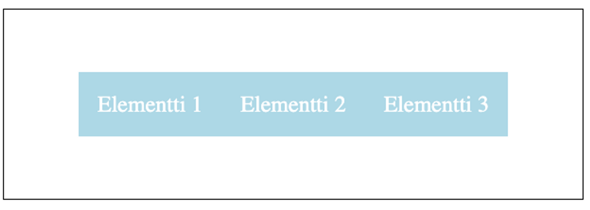
Learn to hack — start here
Hundreds of interactive courses, virtual labs and CTF challenges in your browser. Start a free trial — no card required.